Introduction
This document will lead you through a series of questions about how you want the layout of your Brightcove Beacon Experience to appear. The result of answering these questions will help you build your application design for the Brightcove Beacon Experience. A very simple example of what you want to have defined for your app is pictured here:
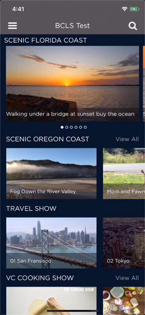
You may not have experience in designing a UX for an OTT app. In the last section of this doc, Is guidance available? , a list of vendors' advice is shown. You may wish to read and consider their guidance before designing your UI.
Recording your categories/selections
You will record your decisions as you work through this document in a spreadsheet. To prepare the spreadsheet follow these steps:
- Download a template by clicking on this link: app-design-layout-options.xlsx . Be sure to remember where it is saved.
- Open a blank spreadsheet from the Google Sheets app.
- From the Google Sheets menu select File > Import .
-
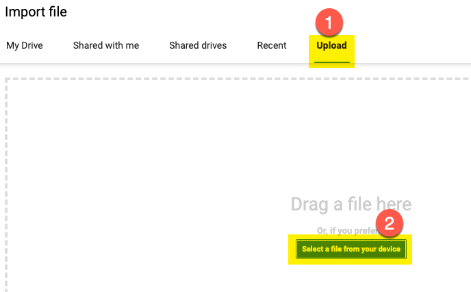
From the dialog that appears, first choose Upload
then click the
Select a file from your device button, as shown here:
- Find the Excel file just downloaded, select it, then click Open .
-
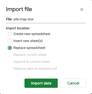
From the
Import file
dialog that appears, choose
Replace spreadsheet, then click the
Import data
button.
-
After the spreadsheet is imported you will see something similar to the following:
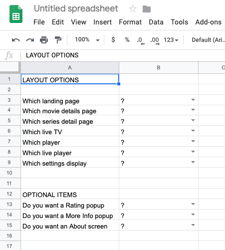
In the spreadsheet you will record the answers to the questions in this document. You will make selections from dropdown lists indicating your choice of layout for a screen.
At the end of this process, you will share your completed Google Sheet with the Brightcove representative helping configure your experience.
Choosing site layout options
The following provide layout options for different parts of your app. The images shown, and from which you will choose your preference, are from a mobile app. Of course, the screens for TV or web will look slightly different. For instance, shown first below is a movie details screen from a mobile app, followed by the same movie details screen from the Apple TV app.
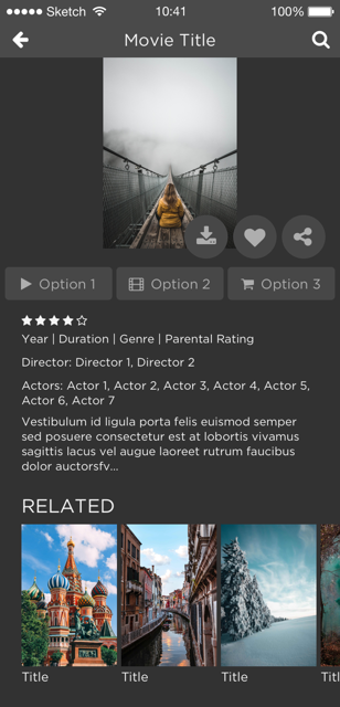
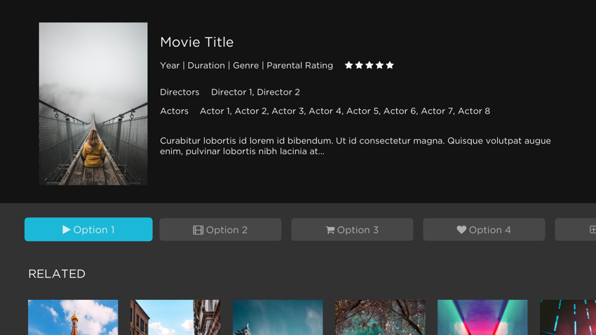
Now it is your time to start choosing options. The following provide layout options for different parts of your app. Review the options for the particular layout, then record your selection in the spreadsheet.
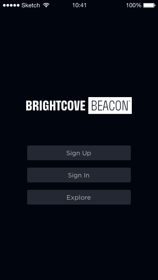
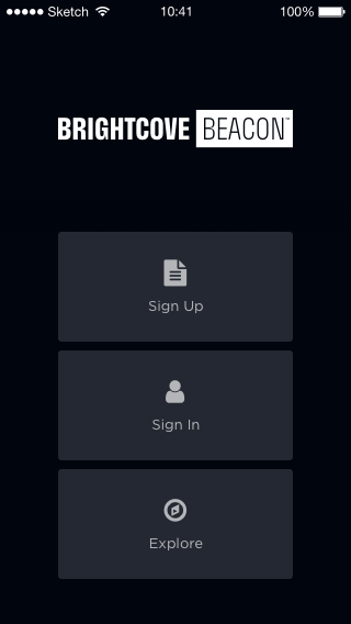
Landing page
The landing page is optional. If you wish to have a landing page choose your layout, otherwise choose None. Note, there is no landing page on the web app. There are two options from which to choose.
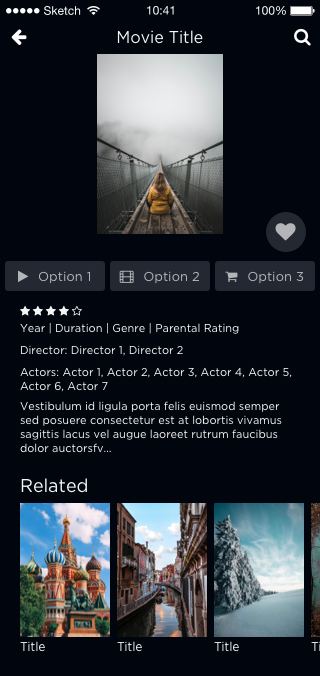
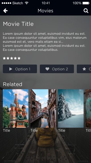
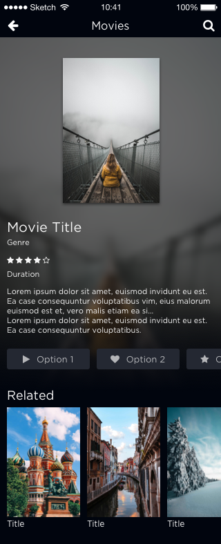
Movie details page
The movie details page displays details for a particular movie, and a list of related movies. There are four options from which to choose.
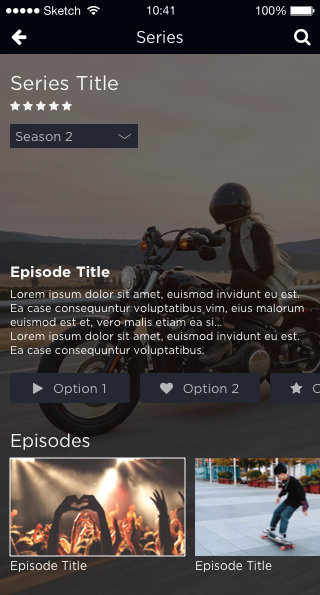
Series details page
The series details page displays details for a particular series, and a list of related movies. There are two options from which to choose.
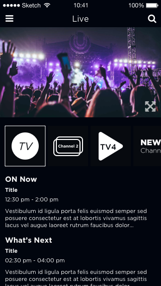
Live TV
The customer can check what is playing now and what will play next on the selected channel. There is one option, and it is shown here.
Player
The same player, referred to as Player E, is used for VOD, episodic content, live events and live channel playback. The following shows the features of Player E:
The following icon in the controlbar is for fullscreen:

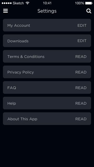
Customer Settings
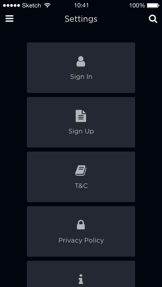
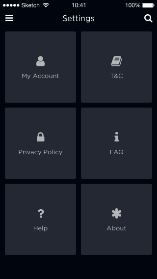
Displays the customers' settings options. There are three options from which to choose.
Optional items
In this section you will decide if you wish to include some optional items. In the spreadsheet you will answer with Yes/No .
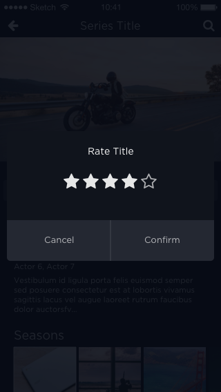
Rating popup
Determine if you wish to use a rating popup..
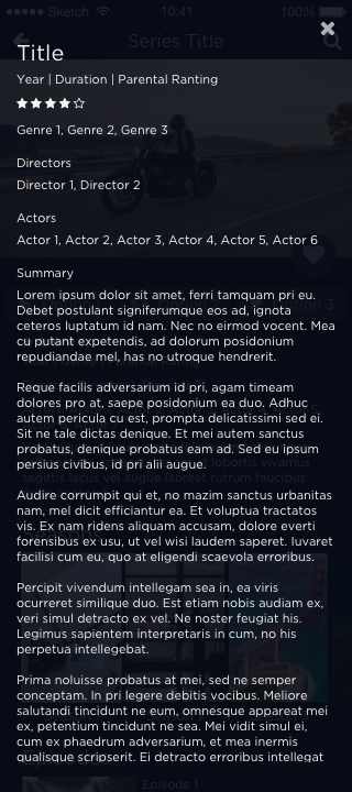
More Info popup
Determine if you wish to use a More Info popup.
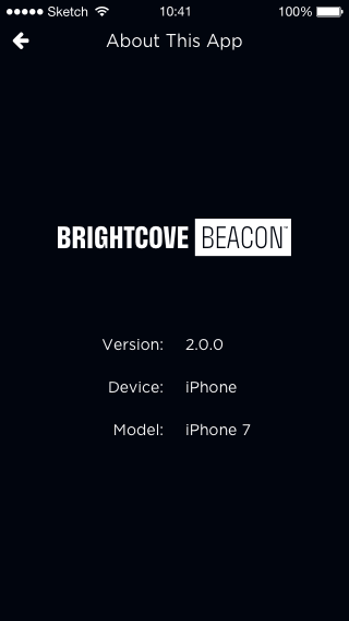
About screen
Determine if you wish to use an About screen.
Moving forward
You've completed this task. Be sure to save the spreadsheet you have been working on for later submission to Brightcove personnel when your Brightcove Beacon Experience is built.
If you have not done so, you need to complete the other part of defining your application design by working through the Creating Your Application Design - Information Architecture to determine what videos you want displayed and how to group and order them.
Page design
You also should start thinking of how you would like individual pages to look. For instance, here is an example home page:
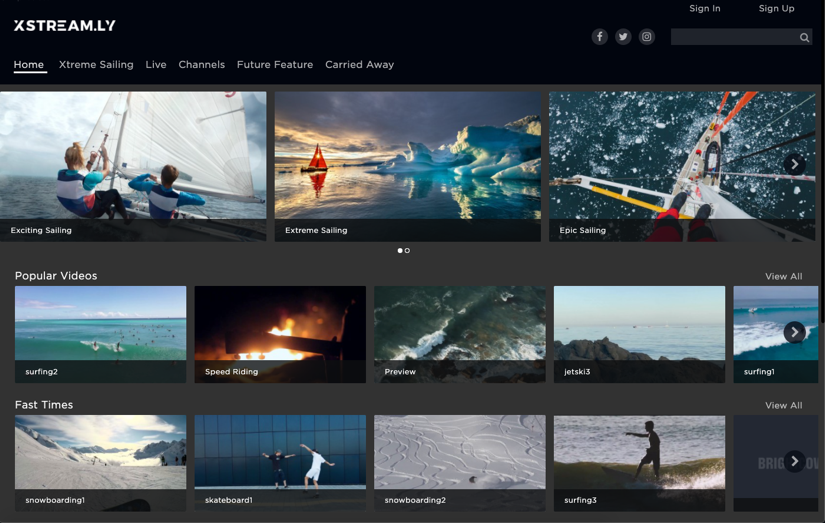
For details on page layout options see the Using Page Layouts document. There the different page types you can use are detailed, along with layout of video content on those pages.
Is guidance available?
UX design is a complicated matter, and you may wish to see what others consider when building a design. The following are links to some of the major OTT players advice on design and best practices.
- Roku: Design Best Practices
- Apple TV: Human Interface Guidelines
- Fire TV: Design and User Experience Guidelines
- Android TV: Design for Android TV

