In this topic, you will learn about the different page layouts, how they appear in your apps and how they fit into the page creation process.
Unsupported layouts
This topic describes all the layouts that are supported in Studio. Note that Classic had some additional layouts that are now deprecated. These layouts cannot be viewed or edited in Studio.
If you try to open an existing layout in Studio, and see this message:
Unsupported layout
Your current layout cannot be edited in this tool. Contact support to make changes.
you will need to contact Support to get help in updating the layout.
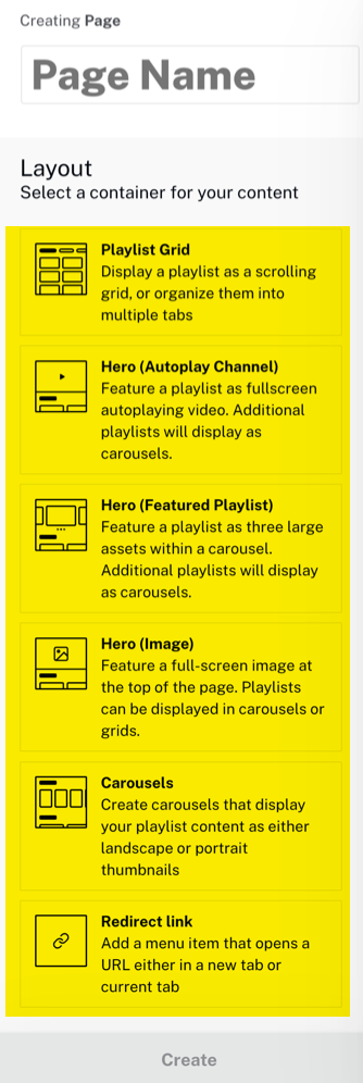
Page creation process
When creating a page you are first asked to enter a title for the page, the page type, then asked to choose a page layout:
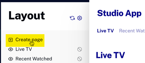
In the Layout module, click Create Page.
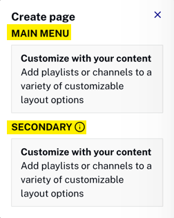
Choose either a MAIN MENU or SECONDARY page type.
Create the page by giving it a name and choosing the desired layout, then click Create.
This document will focus on the page layouts, their functionality and appearance. For information on the entire page creation process see the Creating and Managing Pages document.
Formatting playlists
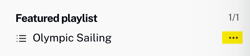
You have flexibility when placing playlists on a page. If you click the three ellipsis (three dots) next to the playlist name
you bring up the playlist settings dialog. Several playlist manipulation options are presenter here.
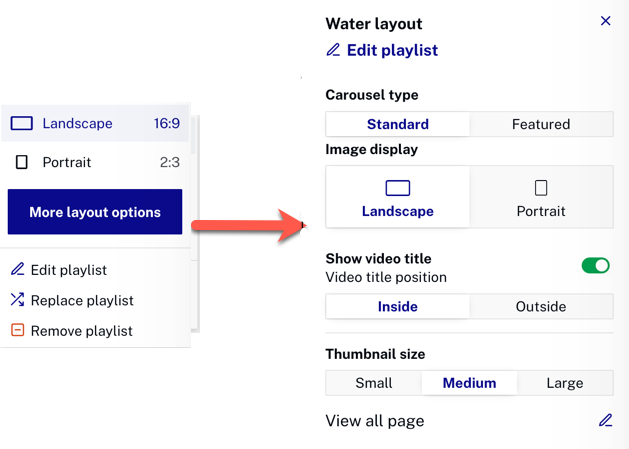
When you click More layout options you see the playlist layout dialog, where more playlist manipulation options are offered.
Not every playlist on every page layout offers all options. Restrictions will be listed where appropriate for each page layout.
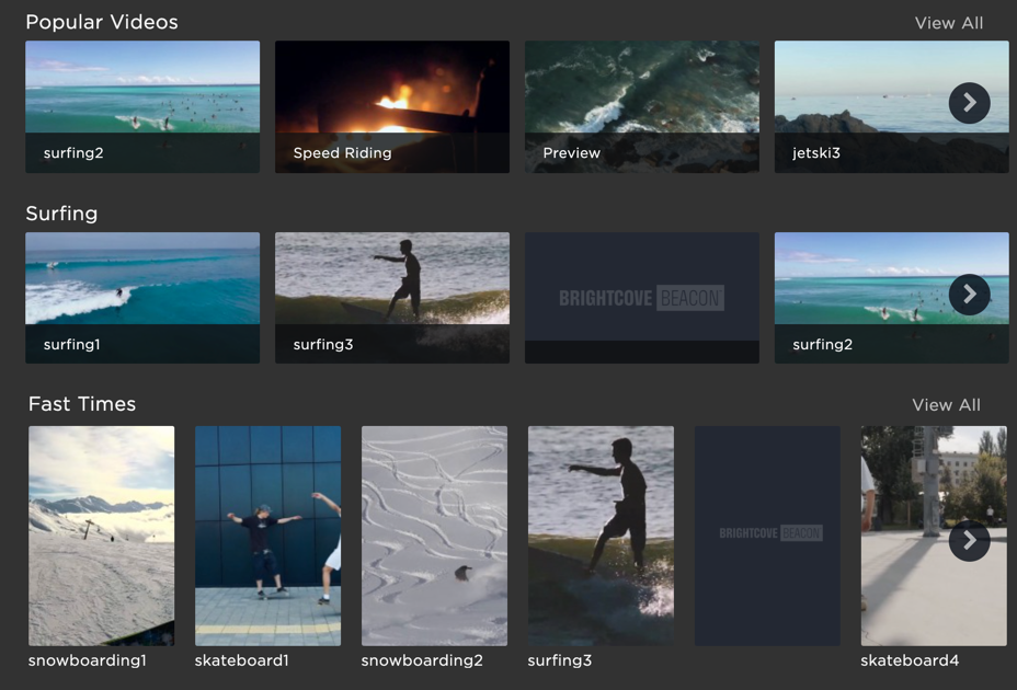
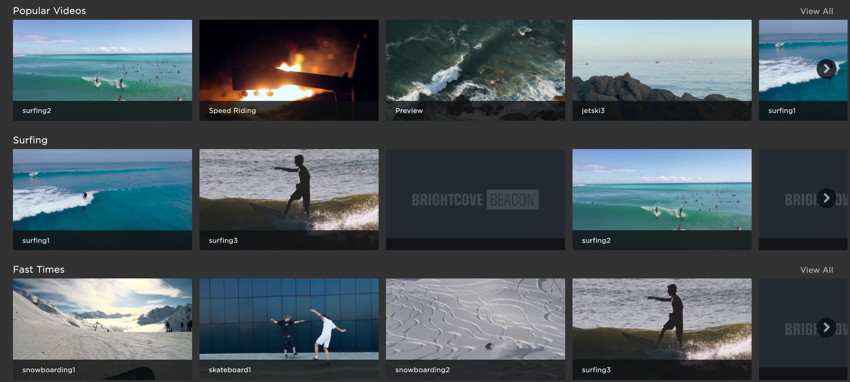
Note the following about the Playlist Grid page layout:
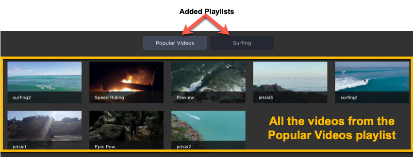
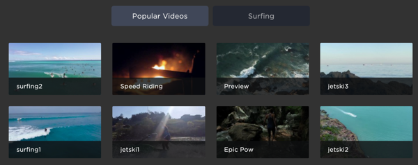
The Playlist Grid displays one or more playlists in grids, meaning thumbnails for all the videos in the playlist will appear on the page. If multiple playlists are selected the playlists names will appear as tabs at the top of the app page, as shown here:
Note that if only one playlist is displayed no playlist name will appear. In this case, you would want to be sure the page name reflected the content of the playlist.
The page layout is responsive. The following screenshot shows the same page previously shown, but at a narrower browser width. Note the the thumbnails are only four across whereas in the wider browser they were five across.
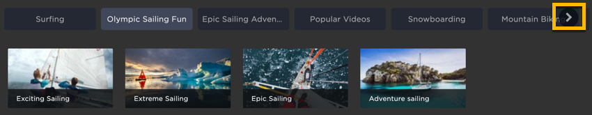
If the number of playlists added to the page makes the playlist name tabs wider than space available, an arrow is added to the right side of the tab list to provide a way to see all the tabs, as shown here:
Once you reach the end, the arrow appears on the left side.
Hero (Autoplay Channel)
Note the following about the Hero (Autoplay Channel) page layout:
Feature a channel as fullscreen, autoplaying video. Play the following video to see the behavior.
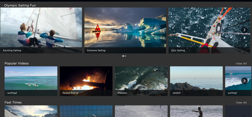
Additional playlists display as carousels.
Valid video content for the playlist with channel are:
A Cloud Playout channel created in Studio
The page is responsive. The playing video reduces in size and the carousels' thumbnails shrink in size and fewer are displayed.
No layout changes are allowed on the autoplay channel.
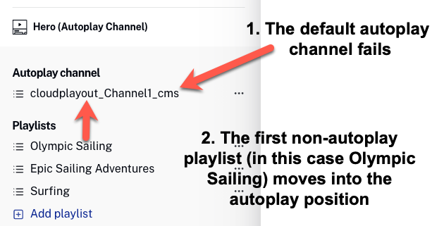
There is a fallback feature that can be confusing if you are not aware of it. If for some reason the featured autoplay playlist cannot play, the first playlist in the normal list of playlist will be "promoted" into the autoplay position. The following diagram further clarifies the feature:
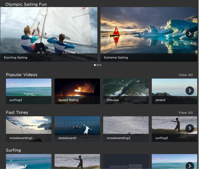
Hero (Featured Playlist)
Note the following about the Hero (Featured Playlist) page layout:
The featured playlist appears at the top of the page with its thumbnails larger within a carousel than other playlists' thumbnails on the page, as shown here:
As seen in the screenshot just above, additional playlists added to the page display below the featured playlist in carousels, using smaller thumbnails.
The page layout is responsive. The following screenshot shows the same page previously shown, but at a narrower browser width. Note the the thumbnails are only two across for the featured playlist whereas in the wider browser they were three across.
In the featured playlist, you do not have the option to display the thumbnails in portrait orientation.
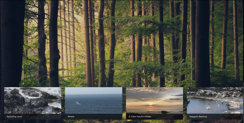
Hero (Image)
Note the following about the Hero (Image) page layout:
The hero image appears mostly visible with added playlists overlaying the image near the bottom of the app page, as shown here:
Additional playlists display as carousels.
The page is responsive. The hero image reduces in size and the carousels' thumbnails shrink in size and fewer are displayed.
Carousels
Note the following about the Carousels page layout:
A new carousels is added for each playlist placed on the page, as shown here:
A chevron appears at either end of carousel for navigation to all the videos in the playlist.
The page is responsive. Here is a narrower view of the page, and also one of the playlist is shown using portrait orientation thumbnails:
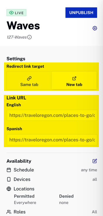
Redirect link
The Redirect link page type allows you to enter a link in the main menu that when clicked sends the viewer to a web page URL. This is functional for web, iOS and Android apps. You can choose to either open the page in the same tab or a new tab. The following video shows the following:
iOS same tab redirect
iOS new tab redirect
Web new tab redirect
You can set the Redirect link target and the Link URL for all supported languages, in addition to standard Availability setting.
 appears at either end of carousel for navigation to all the videos in the playlist.